We have long accepted that repetition leads to physical memory, and it is also generally accepted that a large number of reps are needed to ingrain a physical memory (10,000 is the fave). But are some movements or sequences of movements more easily remembered, or more swiftly ingrained than others? In other words, are there sets of movements that are somehow Biomechanically or Kinesthetically Mnemonic? Is this what good drill progression do? Ingrain desired movements more swiftly.
Moreover, are some movements “catchy”? Like a song that you just can’t get out of your head, are there movement patterns that you just can’t get out of your body? Does it follow then that like catchy phrases, these sets of movements are neither intrinsically good nor intrinsically bad, just memorable, indeed “infectious”? So, like lyrics, where we may say that a catchy tune full of misogynist concepts is to be shunned in a society that values equality, so too are som drills or workouts packed with infectious but undesirable mnemonic movements?
mne·mon·ic
nəˈmänik/
noun
1.
a device such as a pattern of letters, ideas, or associations that assists in remembering something.
adjective
1.
aiding or designed to aid the memory.
catch·y
ˈkaCHē,ˈkeCHē/
adjective
(of a tune or phrase) instantly appealing and memorable.
“a catchy recruiting slogan”
synonyms: memorable, unforgettable, haunting; appealing, popular; singable, melodious, tuneful, foot-tapping
“I’m not sure what their product is, but they’ve got a catchy little jingle”
Masters athletes, and new to swim athletes in specific, often think about what kind of paces they can hold in training in terms of sets of 100s, sets of 200s, etc, with the goal to improve their time for swims that are greater than or equal to a mile in length. When seeking greater speeds in those sets they tend to ask what technical improvements they can make, and seek to make those improvements in the course of their workouts – doing 100s, 200s, etc. while “thinking about their stroke”. But as you practice some new technique, your body is inevitably weak in terms of repeating that technique because it has not practiced it much. The technique will therefore tend to degrade as one swims 25, 50, 75+ yards continuously. In my experience, this degradation is so pronounced that much of the technique change that is desired disappears after roughly 50 yards, and the “new” stroke becomes unrecognizable after 100.
If we accept this as a truism for many athletes, shouldn’t we instead try to focus on how fast they can swim 25 yards at a pop? And to make us “stronger”, focus on how fast we can do 25 yards, and how many 25 yard repeats we can do? For some context, I wanted to look at just how fast one needs to be in an all out 25 in order to reach a given speed in a mile. The two current American record holders in the 1,650 yard freestyle are as follows:
- Womens 1650 record holder – Katie Ledecky, 15:15, averaging 55.5 / 100, or 13.9 seconds per 25.
- Mens 1650 record holder – Martin Grodzki, 14:24, averaging 52.4 / 100, or 13.1 seconds per 25.
Let’s estimate that Katie Ledecky can swim a 25 in 11.0 seconds. Estimate that Grodzki can go a 10.0 for his 25 sprint. If we take these as reasonable estimates of their top speed capabilities (if someone has exact knowledge, feel free to share), then for their record swims, they averaged approximately 3 seconds per 25 slower than their all out speed. 3 seconds per 25 at these speeds means that their endurance time per 25 is about 130% of their sprint lap time. Let’s say they can average an additional 1 second per 25 slower for a 2+ mile swim, which would equate to a lap time of ~ 140% of their all out sprint.
So… if you are physiologically suited for the a 15-20 minute event, and trained to the limit of your endurance capabilities, then you should be able to average approximately 130% per 25 of your all out 25 sprint time, and you can do 140% per 25 in a multi-mile swim. What does this mean in terms of performance in an open water endurance race? Based on the paces outlined here one needs to be capable of averaging about 1:13 per 100 in a threshold pool set to break 1 hour in a non-wetsuit ironman swim. So. take this 1:13 per 100, which is 18.25 seconds per 25 as your goal speed. 18.25 is 140% of 13 seconds, so, to break an hour in an Ironman non-wetsuit we need a sprint speed of 13 seconds in a 25. Other benchmark speeds are as follows:
- If you can go 16 seconds in a sprint 25, then your max endurance rate would be 1.4 * 16 = 22.4 / 25 which translates to an ironman swim of about 1 hour 11 minutes.
- If you can go 18 seconds in a 25, then your max endurance rate would be 1.4 * 18 = 25.2 / 25 which translates to an ironman swim of about 1 hour 21 minutes.
High Elbows, Low Hands, Fast Vs. Slow
I was at the pool yesterday watching one of my colleagues work with a swimmer who was struggling mightily to pull water. She demonstrated what folks often call a “dropped elbow”. When describing fast freestylers we often describe how they appear to have “high elbows”, meaning that their elbows are “high” relative to the surface of the water. What we don’t mention as often is that a corollary to the “high” elbow is a “low” or “deep” hand. With the elbow at a shallow location and the hand at a deep location, the result is what we often describe as “Vertical Forearm”. Figure 1 shows a really great demonstration of this (courtesy of the folks at SwimSmooth.com).
 Figure 1: Rebecca Adlington’s left arm at the “catch” portion of the freestyle stroke. Via SwimSmooth.com http://www.swimsmooth.com/catch_adv.html.
However, not all fast swimmers have this exaggerated an elbow bend, and indeed, scientists are now beginning to say that there is evidence to suggest that a straight arm pull in the underwater portion of the stroke may actually be more propulsive. Glen Mills over at goswim.tv has a nice article summarizing these developments – http://www.goswim.tv/entries/6658/freestyle-the-deep-catch.html. Of course, scientists theory and reality are not always in lock step, but my own personal experience suggests that there is something to this “deep hands”. A couple of years ago I wrote a blog that described my impressions after watching a oarticularly talented young swimmer – I was struck by how his hands seemed to dart into the water and reach their deepest point very swiftly (see here http://www.findingfreestyle.com/?q=h2okiesvo2).
Some Hypotheses
I was wondering about this whole topic yesterday, because while the scientists predict that straight arm should be faster, experience tells us that so many, indeed, probably a majority, of fast swimmers tend towards the high-elbow EVF model instead of the straight arm underwater (Janet Evans being a notable exception). So, what commonalities do they have, and/or what deficiencies in the straight arm does the bent arm make up for. Here are some hypotheses:
- Rigidity – An effective paddle is rigid (this is in contrast to a hydrofoil or wing, which relies upon some measure of pliability). That’s why oars are not flexible. An EVF, by rotating the arm outward, helps to lock the elbow making the arm move as a single, solid unit through the water. A “dropped” elbow by contrast, behaves more like a wet noodle in the water with the hand trailing along behind.
- Rotational Stability – The high-elbow is actually a result of an internally rotated shoulder (http://www.swimmingscience.net/2011/11/shoulder-internal-rotation-for-swimmers.html), which creates a tension that helps to prevent the rotation of your paddle, enabling you to maintain a hand that is perpendicular to the direction of the pull – in other words it keeps your hand from turning to the side and “slice” the water.
So, in sum, I will suggest that there is absolutely nothing wrong with a straight arm pull. Also, there is nothing inherently virtuous with a bent arm pull. The commonalities between successful swimmers of either ilk is that they maintain a rigid and rotationally stable paddle – how they manage that is a matter of individuality. However, to start by learning straight arm might be a really good way to develop basic feel for the water since it is a hell of a lot simpler, less abstract, and easier to achieve than EVF.
A recent blog by @VeloClinic (What Does 0 Vuelta Positives Mean?) pointed out some research that bio-passport experts (some of them members of the UCI biopassport panel) have been doing to improve the certainty of their detection methods (Morkeberg et al, http://www.ncbi.nlm.nih.gov/pubmed/22119492). The paper in question evaluated 3 algorithms for automated detection/screening of an athletes blood values to find evidence of re-transfusion of stored blood – the subjects had either 1 or 3 bags of blood re-transfused (stored either refrigerated or frozen). There are two very important facets to what they are doing (in my opinion):
- Time Series – These methods are “time series” methods in that they evaluate two successive readings, taken 7 days apart, for a single athlete to detect a re-transfusion event.
- Unsupervised – The methods were “unsupervised”, that is, they ran without human intervention to give a “positive” or “negative” reading.
About the “unsupervised” algorithm: An unsupervised algorithm is not a replacement for a panel of experts, but rather a supplement to one. Thus, the results of a particular metric or set of metrics should not be considered as the state of science, but rather as an interesting glimpse into the ins and outs of the analytical tools that supplement the minds of the bio-passport panel. Also, this approach is interesting because they take the basic tools Hg and OFF, and add the factor of time, comparing successive measurements.
The results of this study showed that two of the three methods had low percentages of catching doping athletes (some with only a 10-15% chance of catching dopers), but I think that this paper shows some very encouraging signs, particularly in the area of the “intuition” of the passport panelists. The most successful method was one that was based on the “Best Professional Judgement” of the panelists, and saw very high rates of positives (so if you’re a doper and you think that you have a 90% chance of evading detection – think again).
Hits & Misses
In the Morkeburg study, the three methods evaluated were called the “3G”, “AP” and “Absolutist” methods — the “Absolutist” method was based on the Best Professional Judgement of the scientists involved – the scientists set thresholds for changes between two successive values of OFF-score, Hg, or other markers that they thought indicated re-transfusion. This “Absolutist” algorithm was the most sensitive method, since it had an overall detection rate of 80% based on the Hg score, and 67% on the OFF-score, meaning that there was only a 1 in 5 chance that an athlete who WAS transfusing would avoid being flagged by this test. The other metrics (3G and AP) had a very very low level of false positives (0% for for all tests except the Hg Mass test which had a single false positive, < 1%), but similarly had low levels of success – detecting between 11% and 32% of actual transfusions. Figures 1 & 2 show the results of the Absolutist method applied to 5 bio-passport values taken in a single month for a single athlete. In these charts, if the lines cross, the reading is flagged for further review.

Figure 1: Plot of actual [Hb] (blue) and the [Hb] that would be indicative of possible blood re-transfusion based on the previously measured [Hb] value. The profile in this example shows a single positive screening values for [Hb] change at the end of the time series. This athlete would be referred for further examination under a “screen” and “detect” methodology.

Figure 2: Plot of actual OFF-score (blue) and the OFF-score that would be indicative of possible blood re-transfusion based on the previously measured OFF-score value. The profile in this example shows no positive screening values for OFF-score change.
Screening vs. Detecting
The different algorithms proposed had varying detection and false positive rates – with the overall detection rates ranging between 10-80% and the false-positive rates varying between 0-20%. Given the wide range of detection and false-positives, the most likely outcome of this research would be use each of these different tests according to their strengths and weaknesses. Some tests would be used for “screening”, that is, to flag a set of results for further review, while other tests would be used for “detecting” or accusing an individual of doping – these two activities would require different tests. For a screening test, you would want a test that is hyper-sensitive, that is, one with a very small likelihood of missing a doping act, while accepting that a substantial number of false positives might result that would later be reviewed further and discarded. For a “detecting” test, you would want one that was very conservative, that is, unlikely to produce a false positive, since as we have seen in the Jonathan Tiernen-Locke case, once you are elevated to a formal bio-passport review, the likelihood of a leak and taint of scandal makes a permanent mark on an athletes career in the public eye.
Screening With the Absolutist Method
Since the Absolutist Hg (AbHg) and Absolutist OFF-Score metric (Ab-OFF) detected 80% of transfusions & 67% of transfusions respectively (100% and 43% for the set of subjects who had only 1 bag of refrigerated blood re-transfused) it would be a good screening method. The Absolutist metrics can be considered as very conservative: they added 20% and 5% of false positives to the 80% and 67% actual positives that they caught. Figures 1 & 2 show the Absolutist method applied to 5 athlete bio-passport values taken in a single month. These values would be flagged as positive for [Hb] (Figure 1), but not flagged as positive for OFF-Score (Figure 2). Based on these as a screening method, this athletes profile would be elevated for further examination.
One logical outcome of this type of research would be to have the results during a grand tour screened with this Absolutist method, then reviewed further and subjected to the other methods.
In a previous blog I showed some excerpts of a large study of professional racers doing the GiroBio (a 10-day UCI under 23 stage race), highlighting trends in Hemoglobin and Hematocrit, noting that Hg tended to drop over the first 5-7 days of the race, but then trended up at the end of the 10 day period in an overwhelming majority of the athletes sampled. Though trending upwards at 10 days, the final levels of Hg at the end of those two races were generally slightly lower than at the beginning of the race, though a portion of the athletes ended the race at a higher Hg than they had begun. I had gotten questions about whether or not Reticulocyte percentage (R%) behaved in a similar fashion. Below is the R% graph for that study, along with some thoughts on what the data may or may not mean.
Increases in Reticulocyte Percentage During a 10-day Stage Race
The graph in Figure 1 shows that for both editions of the GiroBio, the initial response was suppression of R% in the population as a whole after 3-4 days, increases in R% by the end of 10 days, with a significant portion of the sampled population experiencing a net increase in R% over baseline by the end of the 10 day race, indicating that red blood cell production was stimulated in most of the athletes during the latter 5 days of the race. While this trend is quite similar to that seen in the Hg charts, it differs in that in this case the mean value of the population as a whole showed a net increase in R% from the beginning to the end of the race. Whether this stimulation of RBC production was caused by fair or foul means is unclear – that is, is the body naturally over-compensating to the load it is subjected to, or the did the majority of the athletes sampled use of EPO or some other erythropoesis inducing chemical?


Figure 1: A sample normal distribution or “bell curve”. The “fat part of the curve” is represented by the area within +/- 1 standard deviation. From http://www.concordspedpac.org/Bell-curve-SD.htm
Histograms are a graphical technique that allows us to see the shape of a distribution of data. Any data set is assumed to have some distribution, for example, a “normal” distribution is the name for the shape that we describe as a “bell-curve” (see Figure 1). This is the distribution that many natural phenomena (such as human characteristics like height, weight, etc. appear in) — the majority of specimens are somewhere around the median value, and there are a few individuals on either side of the median that represent the extremes of the population (sometimes called the “tails”). It is reasonable to assume that something like Hemoglobin (Hg) is normally distributed throughout a population of humans, with a handful of individuals with extraordinarily high levels, and a handful of individuals with extraordinarily low levels, but with most folks clustered around the median value.

Figure 2: Histogram showing the distribution of Hemoglobin (Hg) values for Chris Horners bio-passport data collected between 2008-2013.
Horners Distributions for Hemoglobin & Reticulocytes
Figures 2 & 3 show the histogram distributions for Chris Horners bio-passport values for Hg (Figure 2) and R% (FIgure 3). It is quite interesting to note that the Hg plot seems to conform to a “normal” distribution quite nicely with values clustered about a median of 14.6. What this graph describes is that of the 39 Hg values recorded in the Horner Bio-Passport dataset, 17 of those values (nearly half) fall between 14.4-14.8, with the aforementioned median value of 14.6. Only 5 values (12 %) fall below 13.6 or above 15.6. But, “normal distribution” and “looks normal to me” are two entirely different ideas – “looks normal” would require a sense of what we “should” expect if nothing was amiss – or if the athlete were not trying to manipulate their values (through legal means or otherwise).
Reticulocytes
 Horner’s R% has a much different distribution, with the median value of 0.7 NOT coinciding with the peak. There appears to be a peak of R% values about 0.5 and another about 0.8 – we might describe this as a “bi-modal” or “two peak” distribution. However, this is not to say that an individuals Hg or R% should be normally distributed. I don’t honestly know, though I would say that it might be reasonable to speculate that the Hg level would be more likely to be normal than the R%, since the R% is a kind of “2nd order” function, since it changes in reaction to fluctuations in the Hg level (actually, it responds to fluctuations in O2 levels, which are a function of Hg).
- Ashenden, et. al. Standardization of Reticulocyte Values in an Antidoping Context. http://ajcp.ascpjournals.org/content/121/6/816.full.pdf
A few years ago a good friend of mine, David Luscan, had a fairly remarkable season time-trialing his bike. In a nutshell, he was a long time triathlete who was experiencing a 2 year plateau in biking power, and having thoroughly exhausted the “20-minute-intervals-to-a-more-powerful-you” approach, decided to try out some high volume cycling. A month of 20 hour per week training on the bike, followed by two months of what might be called a “taper” or “sharpening period” left him 40 watts stronger and 4 minutes faster for a 40k TT (the full store is detailed here: http://www.findingfreestyle.com/?q=blog_breakingthrough2010 ). The following year he resumed the use of focused threshold intervals, and while he was more or less stagnant in terms of power gains, he spent less hours on the bike, and ran and swam to boot.
What does it all mean? Does it mean that it may take a lot of volume to break through a hard-earned plateau (2010), but that you can maintain those gains with a lower volume, higher intensity approach in subsequent years? Or, “it takes a lot to improve but less to maintain” I don’t know, but here is what it looks like. The figures below show his breakthrough season (2010) on the top (Figure 1), and his subsequent “no stronger but less training” season on the bottom (Figure 2). Histograms like this tell us how a given set of things are distributed. So, in this case we have a plot of all the time Dave spent cycling in 2010 and 2011, categorized according to how many watts he was putting out at the time. The wattages are broken into 5 watt ranges (the x axis), and the percent of time that he spent in that watt range shown on the y-axis. For example, Figure 1 tells us that Dave spent 4% of his total time in 2010 riding between 205-210 watts, and in 2011, only 1.5% of his time was spent between 205-210 watts. If you add up a block of these you can get some more information. For example, in 2010, Figure 1 shows that Dave spent about 30% of this time riding between 200-250 watts, whereas he spent about half that amount, roughly 15% of his time riding at 200-250 watts during 2011. These graphs are a stock output from the Training Peaks software.

Figure 1: Histogram showing percent of training time spent at a range of wattage levels. Plot is for David Luscan during his 2010 season where he biked exclusively. Plots generated with Training Peaks – http://www.trainingpeaks.com

Figure 2: Histogram showing percent of training time spent at a range of wattage levels. Plot is for David Luscan during his 2011 season where he swam biked and ran. Plots generated with Training Peaks – http://www.trainingpeaks.com
A large amount of attention has been given to Chris Horner’s release of his biological passport records from 2008-2013. This is, to my knowledge, the most extensive, longest term set of bio-passport records ever released by a single athlete. They have generate a lot of interest, with a number of blogs (Velo-clinic, Bike-rack-heads, JournalVelo, and VeloNation) and even Outside Magazine pointing out what they feel are things that Mr. Horner should explain. Several of these analyses (though not all), share two common themes, themes that I believe are in error. These problematic themes are:
- Many focus largely on the notion that Hemoglobin (Hg) should demonstrate a gradual decline over the duration of a grand tour, and that any “rebound” during the latter half of the tour is indicative of suspicious activity, or at best indicator that a “rebound” or “V-shaped” Hg trend is the characteristic of a small minority.
- They fail to look at the interaction between Reticulocyte Percentage (%R) and Hg when raising concerns about low-%R an blood-doping.
The first idea, that a rebound is suspicious or rare, is contradicted by the study of over 200 athletes during the Giro Bio (mentioned in a previous blog) which suggests that a rebound is, in fact, the norm rather than the exception. The second, looking at low %R in absence of the corresponding Hg values is one that gets to the heart of bio-passport profiling and the OFF-score (a bit on that here).
Interplay Between Reticulocytes and Hemoglobin
I am going to attempt to provide some objective context to the 2nd issue, that of evaluating the Hg and %R in isolation of one another by describing the trends in the two data sets (Hg versus %R) and how they relate to one another. I am not a hematologist, so I will try to refrain from making a conclusion about this data. However, as a data analyst, I think that it is possible to put forth an objective set of observations about these two series and how they pertain to what is commonly understood as the basic underlying processes of red blood cell production. I will refrain from discussing the absolute values of these numbers in context of what is “normal”, except to note that Horner’s OFF-scores in this 5 sample set ranged from 90.91 to 106.53, all within the current WADA guidelines for normal variation. I will first present my description of individual trends, then present my observations about the interaction of those two trends, finally, I will present my thoughts about how that interaction relates to basic concepts of RBC production in the form of a question to hematologists or blood doping experts.
Descriptions of overall data trends

The following observations are pertaining to Horner’s anti-doping tests around the time of the 2013 Vuelta (depicted in Figure 1 above). The first test occured 2 days prior to the start of the race, and the subsequent 4 tests occurred between the 5th and 20th days of racing.
- Both Reticulocyte % (R%) and Hemoglobin (Hg) values are at their highest (0.85 & 15.2) at the first sampling date, 2 days before the start of the 2013 Vuelta.
- Reticulocyte percentage (%R) are at their lowest observed level on day 5 of the race (0.39), by the 9th day of the race they have climbed back up to 0.55 and then stabilize 0.55-0.56 for the remainder of the race.
- Hg values are at their lowest observed level on the 9th day of the race at 13.5.
- Hg values climb back up by the 13th day of the race and stabilize somewhat, varying between 14.3 and 14.6 during the last 8 days of the race.
Interactions between the 2 data series
- Decreases in %R occur before Decreases in Hg – The lowest %R sample was 3 days before Hg reaches its lowest point.
- Increases in %R occur before increases in Hg – %R begins to rebound on the same day as Hg values are at their lowest level, with the largest increase in Hg taking place 4 days after the largest increase in %R.
The Chicken and the Egg
The following are based on a single underlying concept about Red Blood Cell (RBC) production:
Given – It is understood that it takes approximately 4-7 days (as described here & here) for the full life cycle from initial production in the bone marrow to RBC, with the transformation from the stage known as a “reticulocyte” to the mature, fully functioning RBC taking about 2 days (as noted in Guyton’s “Physiology of the Human Body”).
Observations/Questions for Hematologists
If this life-cycle time period is true, then I would suggest that following:
- A lag-time between the production of new RBC’s and increasing Hg concentration, as shown in the latter part of the race, seems to conform to the basic principles of RBC production.
- Since RBC-enriched blood transfusions suppress reticulocyte production, and Horner’s Vuelta drop in %R occurs along with a drop in Hg, wouldn’t this be counter to the effect that would be expected if Horner were transfusing enriched blood?
- Has there been some follow-up research that shows approx. 95% of athletes in Grio-Bio having an Hg rebound in the latter part of a grand tour to be irrelevant or flawed?
None of this is to say anything about whether Mr. Horner was doping during the 2013 Vuelta, or if he has ever dabbled in the Dark Arts. But it is important, I think, to view data as an integrated whole, as opposed to in isolation, which is the whole point of the Bio-Passport. Context is key.
Disclaimer: I am not a physician, hematologist, anti-doping expert, or even a veterinarian. I am just a coach and athlete who has a passion for data analysis, visualization and clean and fair sporting.
As mentioned previously in “You’re 1 in 1,000 Baby: Understanding the Bio-Passport OFF-Score”, there are a range of OFF-scores that are defined by the WADA BioPassport guidelines that describe the upper and lower values of OFF that are considered “normal”, or more precisely, the range of values that describes 99.9% of the variations in the normal population. The OFF-score equation and this “normal range” implicitly states that there is a causal relationship between a persons percentage of Reticulocytes (%R) and their amount of Hemoglobin (Hg), in plain language it says “for a given Hg value there is a normal range of %R that would be expected”.
A Normal Probability Space
Figure 1 is a “Probability Space”, it shows a band of %R that are expected to produce a given level of Hg, as defined by the upper and lower bounds of the OFF-score from 85 to 100. In other words, the area shaded in pink corresponds to the combination of Hg-R% that fall within that 99.9% of the population range, and therefore do NOT produce suspicious OFF scores, or are considered “normal”. The trend in this “Probability Space” is that it gets wider, and inclines upward as Hg increases. This trend says that if you have a high Hg, you are likely to have a higher R%, but that other factors can produce higher Hg scores. Normal range of Hg for adult males is said to be in the range of 14/18 g/dL, however, st udies of athletes and non-athletes places the largest portion of the population in the range of 14.5-16.5 (ref).
One thing that would be important to keep in mind is that t while this may be a good description of the “probability space” of the population of humans as a whole, it might not be necessarily inferred that this also would be the same shape of space that should occur for a given individual. In other words, an individuals variations might hover about a certain median value for Hg, and their %R values may also have a certain distribution relative to that level of Hg.
Disclaimer: I am not a physician, hematologist, anti-doping expert, or even a veterinarian. I am just a coach and athlete who has a passion for data analysis, visualization and clean and fair sporting.
References
- WALTER SCHMIDT, KATJA HEINICKE, JOEL ROJAS, JOSE MANUEL GOMEZ, MAURICIO SERRATO,
MERCEDES MORA, BERND WOLFARTH, ANDREAS SCHMID, and JOSEPH KEUL, Blood volume and hemoglobin mass in endurance athletes from moderate altitude http://www.setantacollege.com/wp-content/uploads/Journal_db/Blood%20volume%20and%20hemoglobin%20mass%20in.pdf - http://www.sportsscientists.com/2011/07/tour-de-france-2011-the-biological-passport-context/
- http://www.revdesportiva.pt/files/form_cont/Hemoglobin_Mass_and_Biological_Passport_for_the.9.pdf
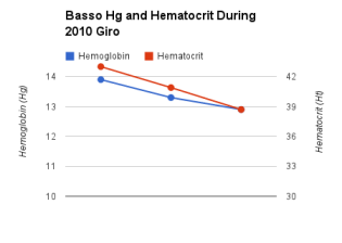
Figure 1: Ivan Basso blood test results showing Hematocrit and Hemoglobin variations over a 21-day stage race from the Giro d’Italia 2010 (source: http://www.velonation.com/News/ID/4607/Bassos-biological-passport-numbers-from-Giro-dItalia-published.aspx).
Many simplify the notion of stress and blood changes to say that we should expect a downward trend in Hg/Hematocrit during a stage race – you’re body accumulates fatigue/stress and it supresses these values, makes sense right? People hold up examples of this as indicative of a “clean” performance (see Figure 1 and the linked article discussing Ivan Basso’s 2010 GdI values).
A slight variation on the “downhill ride” shown in the Basso dataset, was that one in Figure 2, which shows Bradley Wiggins blood test values during his 2009 near-podium at the TdF. Many commentators (not, to my knowledge, the Bio-Passport panel of experts) were skeptical of the “bump” in Wiggins values (see here for one such commentary in NYVelocity). Some still argued that it was OK, since his overall trend was downward, while others made great issue of the 3rd value (labeled “Sion” in the graph) of 4.

Figure 2: Plot of OFF-score and Hemoglobin values for Bradley Wiggins from the 2009 Tour de France.
“V” is for Victory
Despite the allure of the simple notion, “if they have a downward trend, they are clean, if not, they’re doping”, it seems that the reality may be a bit more complex. A recent study was released, which tracked values of over 250 cyclists through the “Baby Giro” a 10-day stage race. This study found a trend that contradicted this simplistic “downhill” trend, stating that
Compared to baseline values, erythrocyte, hemoglobin, hematocrit, MCHC, platelet and reticulocyte counts were all consistently lower at mid-race, but returned to normal by race-end, while leukocytes were increased in the final phase
In other words, it was a “V” shaped curve (see figure 3). What does this mean? Well, this is of course open to speculation. Some might say that since these are cyclists, who are therefore by definition dopers, that it is evidence of how it looks when you are doping. Others might say, no, this is how the body responds to stress. Still another point of view might be that this is only a 10-day stage race, so we cannot infer too much from this to a race of 21 stages. Whatever the perspective, it’s complicated, and it if we accept that the majority of Baby Giro participants were clean, then it paints the “downhill = clean” notion as far too simplistic. From my point of view, I don’t necessarily know what it means, but I would love to see this data from the TdF, Giro or Vuelta published year in and year out. This would give yet another lens into comparison amongst individuals and trends within the peloton as a whole.
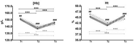
Figure 3: Plots of median value of Hematocrit (Ht) and Hemoglobin (Hg) for 253 riders from the 2010 and 2012 “Giro Bio”.
Disclaimer: I am not a physician, hematologist, anti-doping expert, or even a veterinarian. I am just a coach and athlete who has a passion for data analysis, visualization and clean and fair sporting.
